In 2025, mobile usage continues to dominate how users interact with the web. With over 70% of web traffic now coming from smartphones and tablets, businesses can no longer afford to treat mobile optimization as an afterthought. That’s where mobile-first website design becomes critical.
Table of Contents
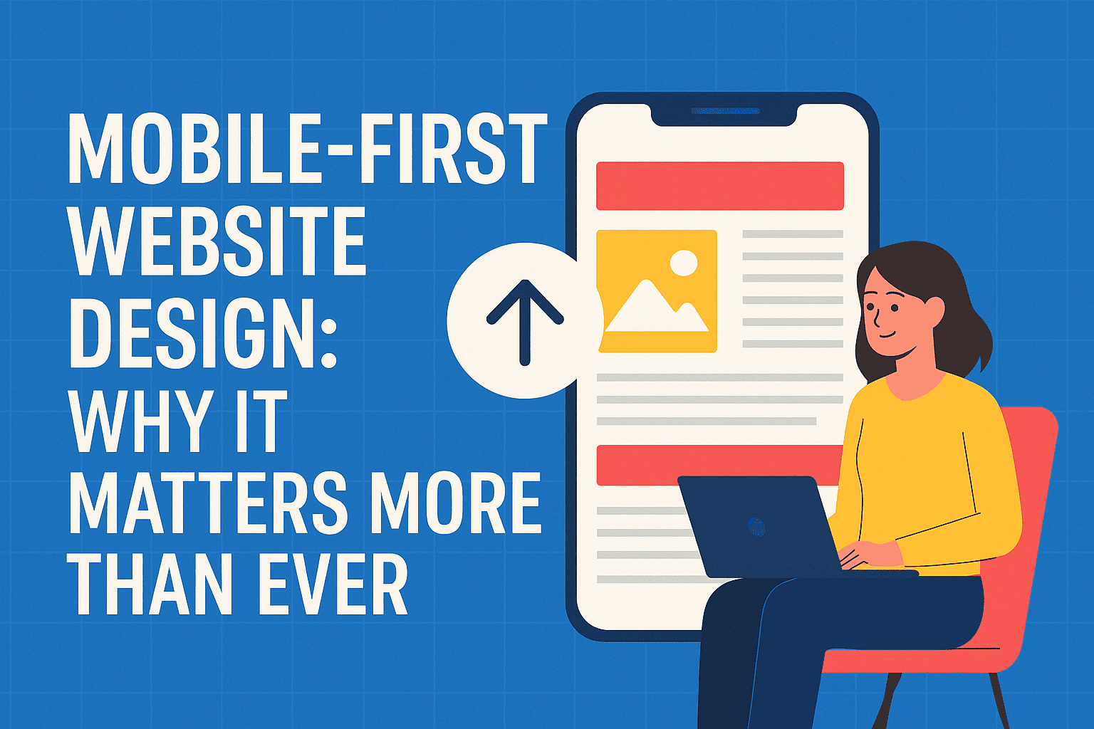
What Is Mobile-First Design?
Mobile-first design is a web development approach where websites are designed primarily for mobile devices, and then adapted for larger screens like tablets and desktops. This ensures a smoother user experience on the devices people use most.
Why Mobile-First Design Is Crucial in 2025
1. Google’s Mobile-First Indexing
Tip: A mobile-unfriendly site may not rank well — even if the desktop version is flawless.
2. Improved User Experience (UX)
Mobile-first design prioritizes intuitive navigation, faster load times, and responsive layouts, making it easier for users to engage with your brand on the go.
3. Faster Load Times = Better Engagement
Sites designed for mobile tend to be lighter and load faster — a key factor in reducing bounce rates and increasing conversions.
4. Increased Mobile Conversions
With mobile commerce growing rapidly, a mobile-first website is essential for converting visitors into customers, especially in retail, services, and local business sectors.
5. Enhanced Accessibility
Designing with mobile in mind often leads to more accessible websites. Clear text, tappable elements, and simplified layouts help all users, including those with disabilities.
Best Practices for Mobile-First Design
- Use responsive frameworks like Bootstrap or Tailwind CSS
- Prioritize content that users need most on smaller screens
- Optimize images and media for faster load times
- Test across multiple devices to ensure consistent performance
- Keep navigation simple and thumb-friendly
Real-World Impact: Case Study from Descom Digital
A local Bhubaneswar-based startup saw a 43% increase in mobile engagement and 28% more inquiries after shifting to a mobile-first layout with Descom Digital’s web design team. The site loaded 2x faster and retained users longer.
Final Thoughts
In a world where mobile is the primary gateway to the internet, a mobile-first website isn’t just an option — it’s a necessity. Whether you’re a startup, a local business, or an enterprise, designing with mobile users in mind will give you a competitive edge in 2025 and beyond.
👉 Ready to upgrade your website for mobile-first success? Contact Descom Digital for a free consultation today!